
 Since September of 2011, I have seen a huge increase in the number of weddings featuring dark purple (often referred to as Lapis or Regency purple). In the world of flowers, there are not as many natural choices in this shade as compared to other colors (yellow, pink, white).
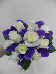
However, with a little creativity, we have come up with some beautiful options for all of our “purple” brides to be!
Flowers that grow naturally in shades of deep purple include: Calla lily, carnations, stock, larkspur, gladiolus, statice, limonium, safora, liatris, dendrobium orchid, iris, hybrid delphinium and tulips. Not all of these options are cost effective or appropriate for all types of wedding styles. Therefore, it is necessary to get creative with how we design with the color palette to make a beautiful presentation.
Consider Designs using purple as the focal point.
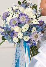 Since purple is a dark color, it is often more balanced to use a lighter, contrasting color to supplement the deeper, more focal color. I would suggest using deep purple with softer shades of ivory/white, pale green, pale pink or lavender to create a design that highlights your thematic color choice, but does not overbear the design.
Add in purple embellishments.
Using jeweled pins in the center of contrasting colored flower blooms is a fun way to sprinkle your themed color throughout your bouquet. Another option is to use ribbon accents in your bouquet. This can be in the form of ribbon loops, bows or streaming ribbons. For the more adventurous bride, consider using feathers or tufts of tulle to create a little flair within your bouquet.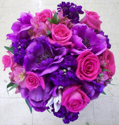
Incorporate artificial flowers into your fresh flower design.
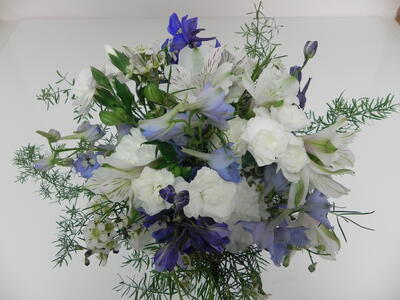
This may seem a little odd at first, but if Mother Nature does not provide what your heart desires, skillful hands probably can! Last year, one of our brides wanted to incorporate purple anemone into her bridal bouquet during a season in which the anemone is off-crop. Her wish was our command! Beautiful artificial anemone is shown here in this stunning bouquet of fresh cut blooms!
Ready to design your dream wedding flowers? Click Below to contact our Wedding Specialist!

Need some more ideas? Check out our website with wedding flowers priced and ready to go!


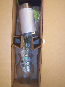
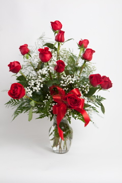






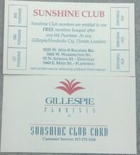 yesterday and she asked about the stack of Sunshine cards we have on our counter. I was surprised she didn’t know about it and thought, “Who else doesn’t know?” Do you know what a Sunshine Card is? Well, Don’t worry! I’m here to tell you!
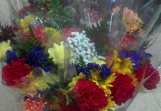 A Sunshine card is a rewards card customers use to earn free flowers! After a customer makes six purchases they earn a free Sunshine bouquet! You can also buy six Sunshines in one visit and get one free!
